
Choosing color for a brand is not an easy task. It is a significant factor to take into account because it enhances the personality of the brand and also influences the emotions it generates in people. Therefore, it is necessary to take into account which color goes more with the essence that you want to transmit depending on the use and the one you want to give to the brand.
It is important to know who our target audience is in order to direct the brand, according to the visual perception, sensations, connotations and existing links that are associated with colors associated with specific professional sectors.
Studies have shown that colors affect people emotionally and also influence the purchase or non-purchase of a particular product. Therefore, we are going to explain briefly what each color is used for in advertising and what sensations it conveys.
Blue
This color is focused in front of the retina, so it gives a sense of remoteness. It is linked to consciousness and intellect.
What is it for?
Promotes products and services related to cleanliness, air, sky, water and sea.
What sensations does it transmit?
Suggests responsibility and inspires confidence. Darker blues denote authenticity, confidence, security and fidelity.
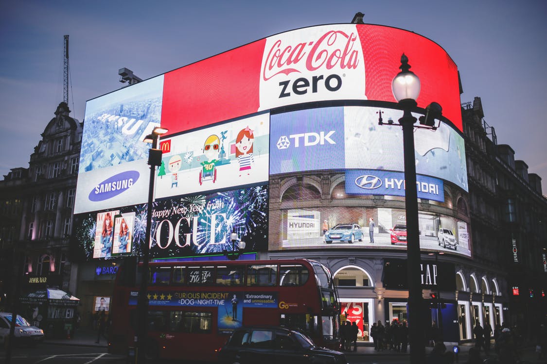
Red
It focuses behind the retina, so it gives the sensation of getting closer when you look at it. It is a color in advertising associated with courage, bravery, passion, energy, excitement and love. It has been proven that red improves human metabolism.
What is it for?
Stimulates energy level depending on the amount of red. It is used to attract attention in the advertising world, as well as during sales and product discounts.
What sensations does it transmit?
It is one of the most powerful and popular colors.
Yellow
It is the color of the sun and is located in the center of the spectrum, it is neutral and the most luminous, so it is used to transmit prevention.
What is it for?
It is very effective in attracting attention. Stimulates creative thinking.
What sensations does it transmit?
Optimism, happiness, brightness and joy.
Green
It is the color of growth, spring, renewal and rebirth.
What is it for?
It is used in products related to health, environment and ecology.
What sensations does it transmit?
Health, freshness, peace and solution to environmental problems. It also suggests fertility, freedom, tranquility, stability and resistance.
White
Symbolizes a new beginning. Sophisticated color.
What is it for?
It is used in topics related to medicine and health.
What sensations does it transmit?
It implies innocence and purity, it helps us in times of stress to move forward and leave the past behind. It means equality and unity.
Black
It is overbearing and can evoke strong emotions, its excess can be overwhelming.
What is it for?
It is used to advertise jewelry and sophisticated products.
What sensations does it transmit?
It is associated with power, elegance, secrecy and mystery.
Gray
It is the color of intellect, knowledge and wisdom.
What is it for?
Gray is considered the color of commitment. It can also be related to melancholy and sadness.
What sensations does it transmit?
Security, maturity and reliability. It is the color of intellect, knowledge and wisdom, although it is perceived as classic. It implies perfect neutrality.
How does color competition behave in advertising?
Many brands have opted for the opposite color to the one used by their main competitor. Examples of the opposing pairings are Kodak and Fuji, Hertz and Avis or Coca-Cola and Pepsi, among others.